The company
The Heritage Taste is a Malaysian brand of ready-to-cook pastes, crafted from century-old Peranakan recipes. Its mission is to preserve this culinary heritage by allowing anyone to easily recreate authentic meals at home in just minutes.
The context
During my time in Kuala Lumpur in January 2026, I collaborated with the founder of The Heritage Taste. As the brand was transitioning to new pouch dimensions, he wanted to seize the opportunity to modernize and redesign the packaging.
The project guideline
The founder had a clear vision for the new packaging and asked me to integrate three key elements:
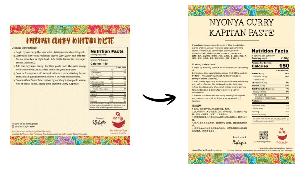
- Bilingual content: Add Mandarin translations to expand into the Chinese-speaking market.
- Brand heritage: Retain the traditional Batik pattern to preserve the authentic and cultural identity of the brand.
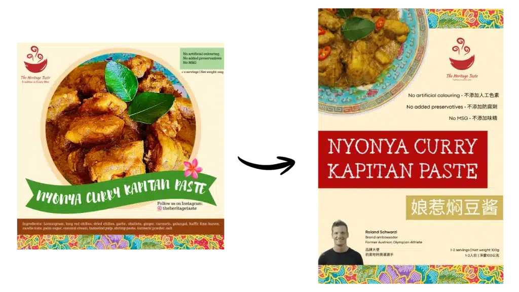
- Brand endorsement: Feature a brand ambassador (a former Olympic athlete) on the front label. It’s a proven marketing practice in Malaysia to build consumer trust and drive sales.
The original packaging
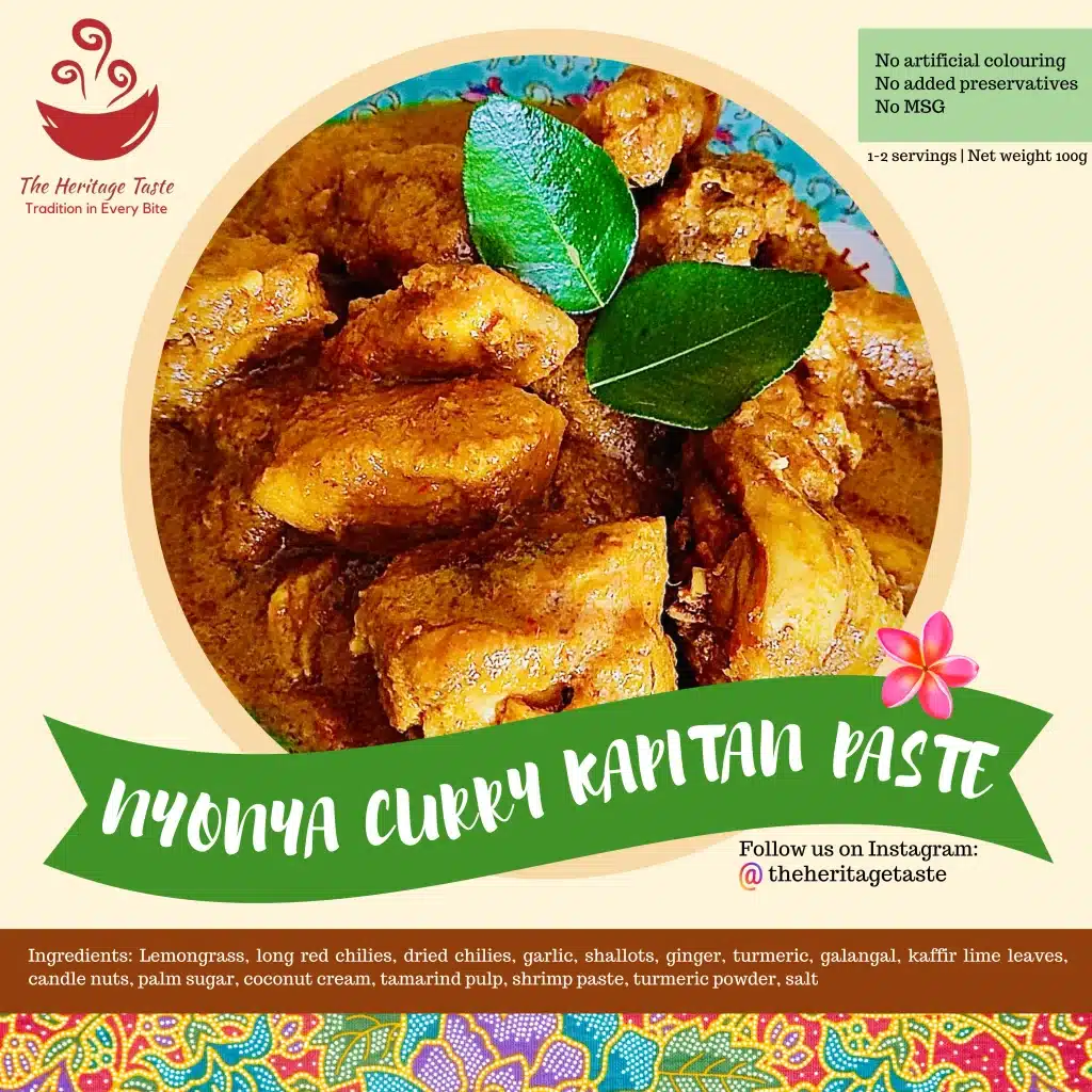
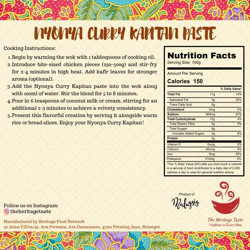
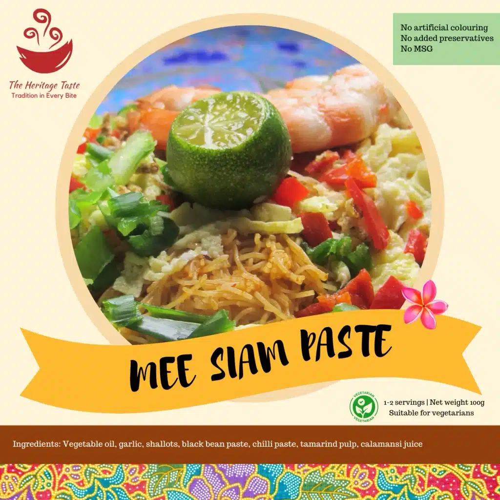
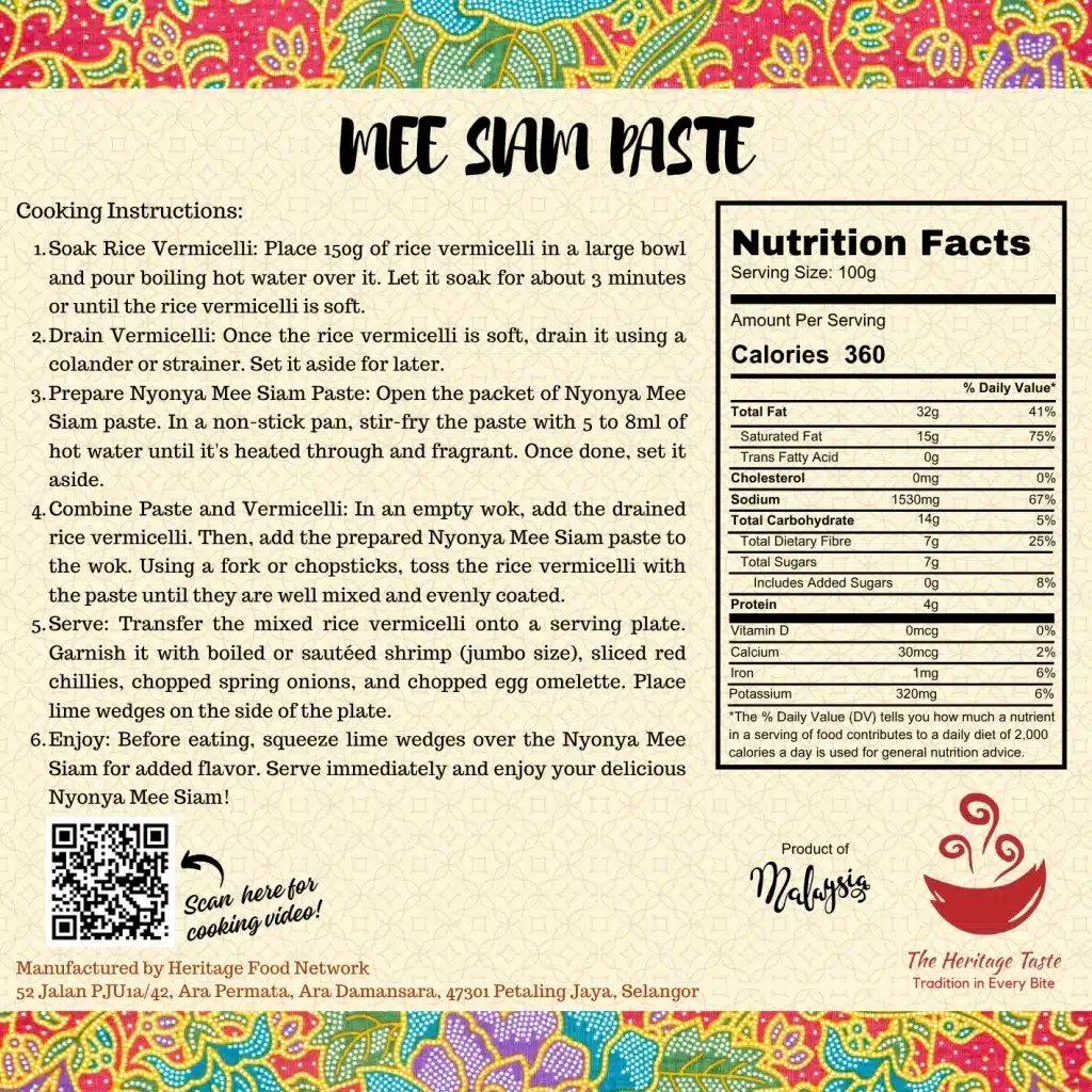
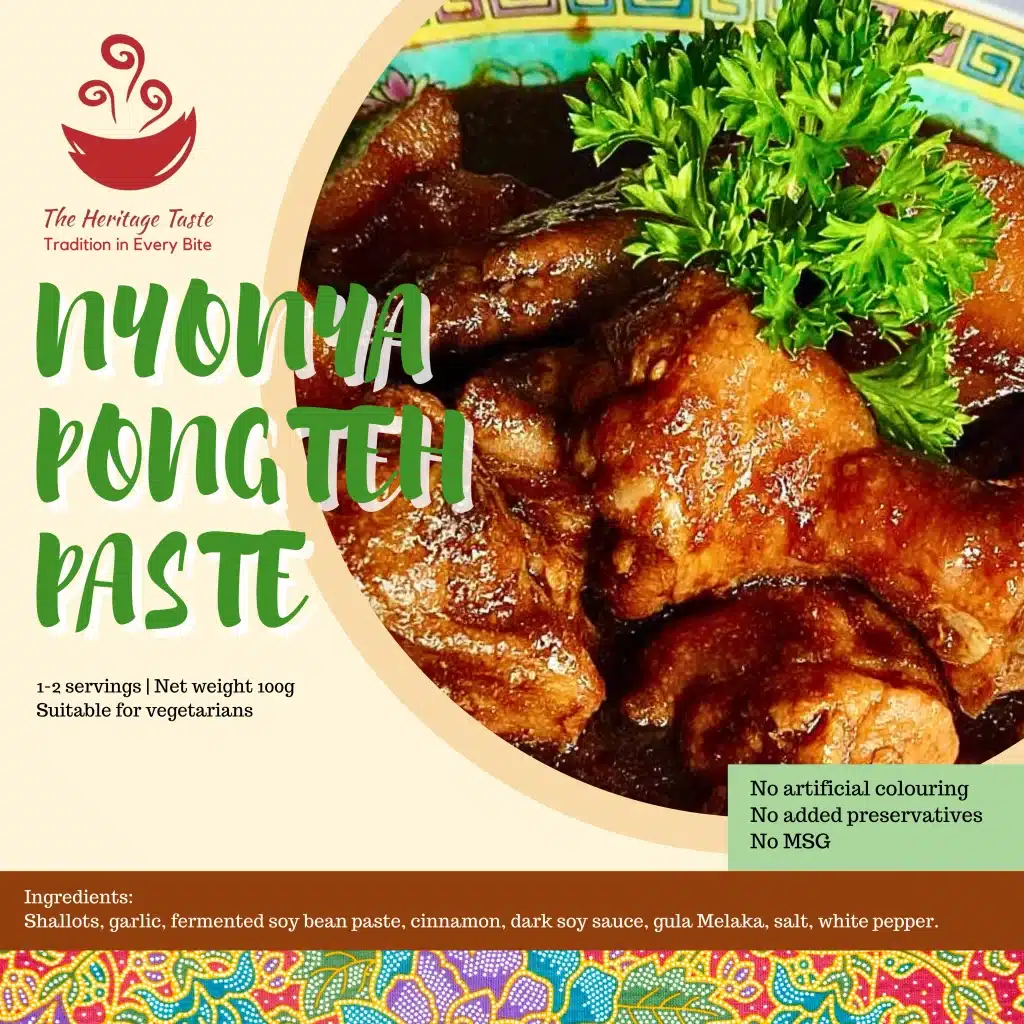
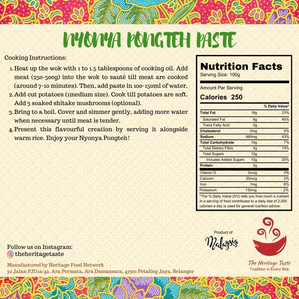
My process
Firstly, I gathered all the necessary assets: a sample of the existing packaging, the logo and Batik pattern in SVG format, high-resolution product photography, and the Mandarin translations.
For rapid prototyping and layout testing, I built the initial drafts on Canva using the new packaging dimensions.
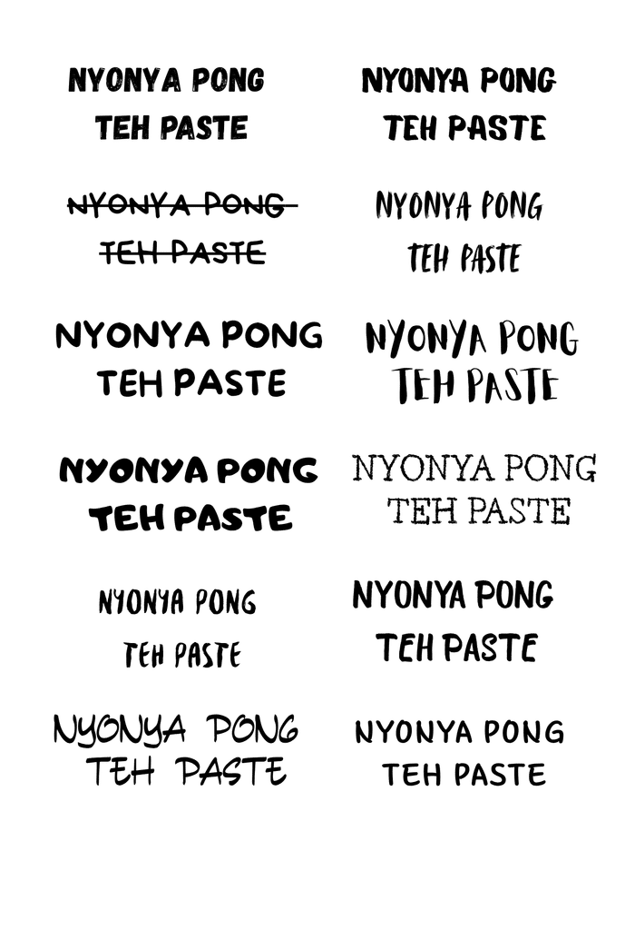
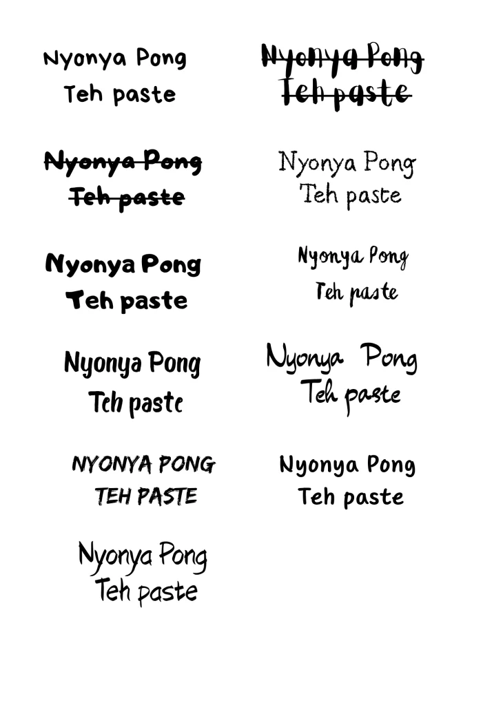
to find one that best reflected the brand’s authenticity:
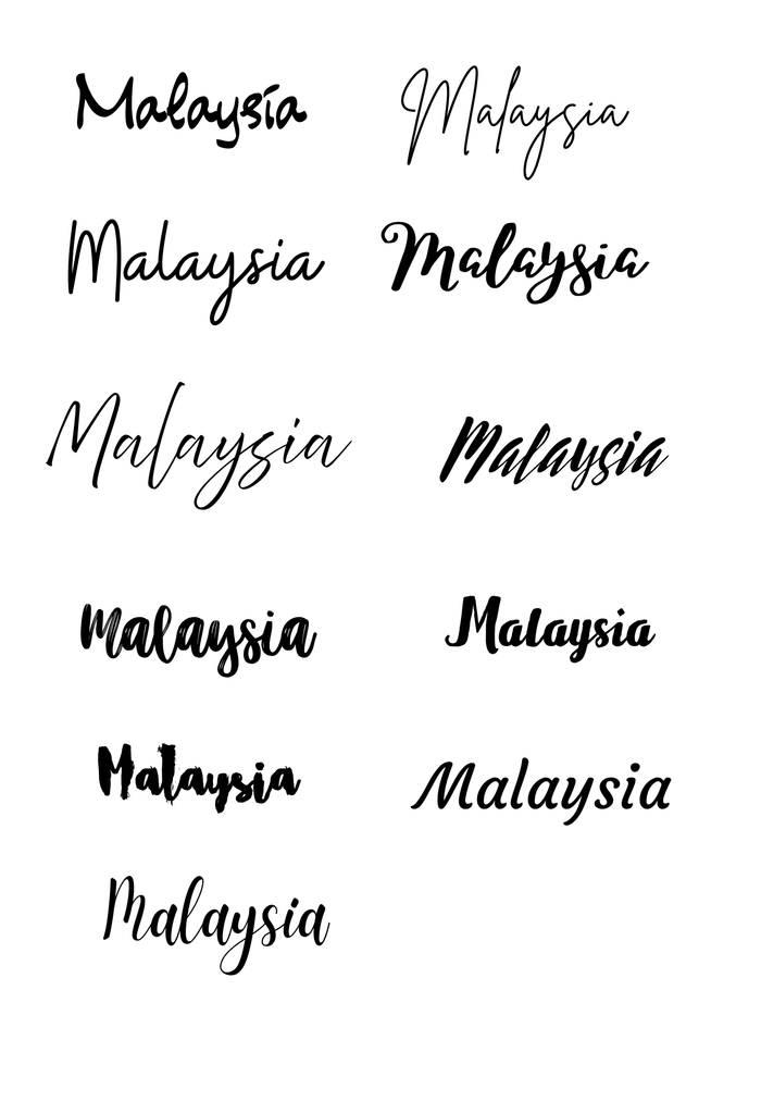
I also tested several script fonts for the “Product of Malaysia” mention:
Then, I tried different designs:
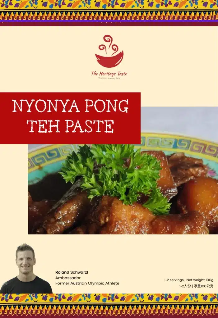
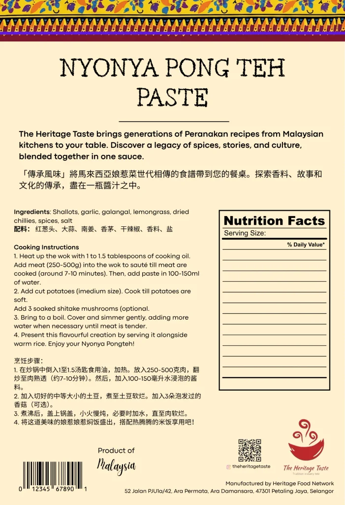
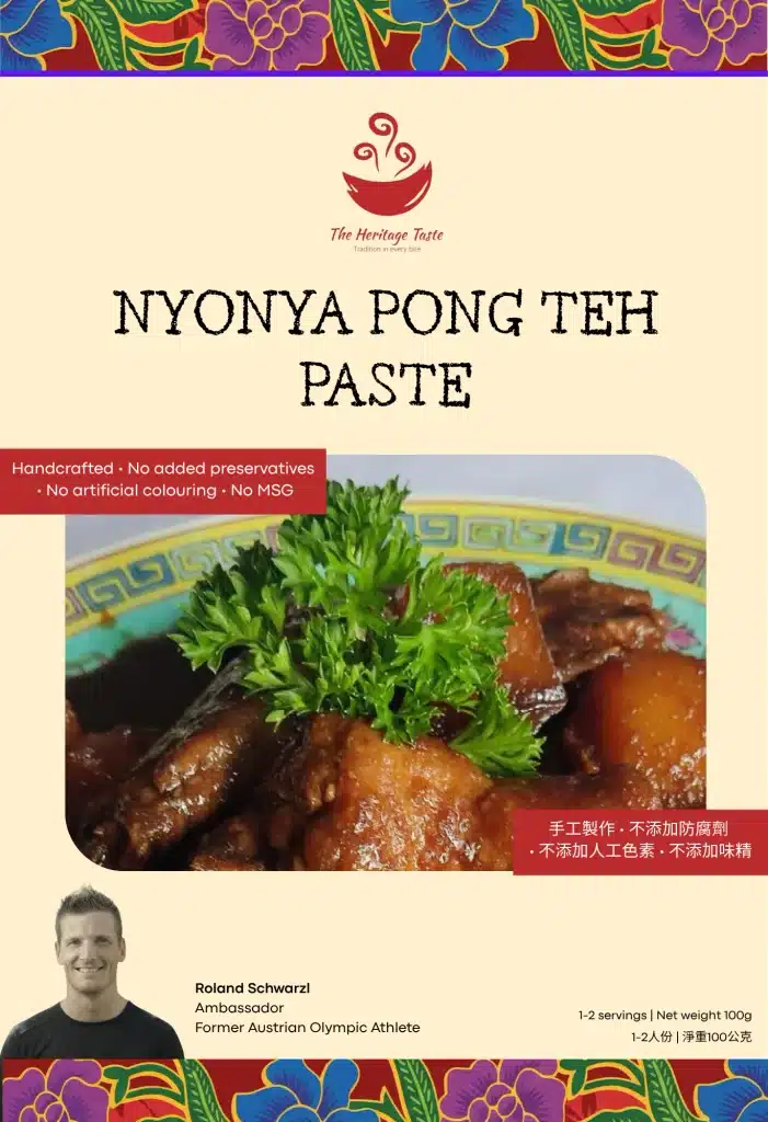
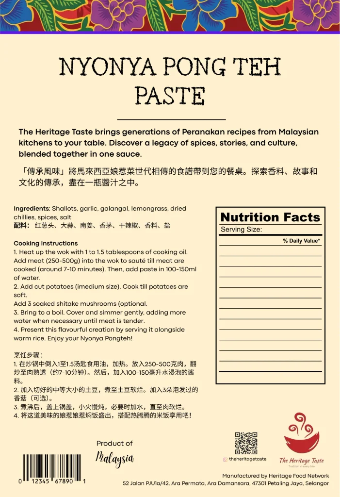
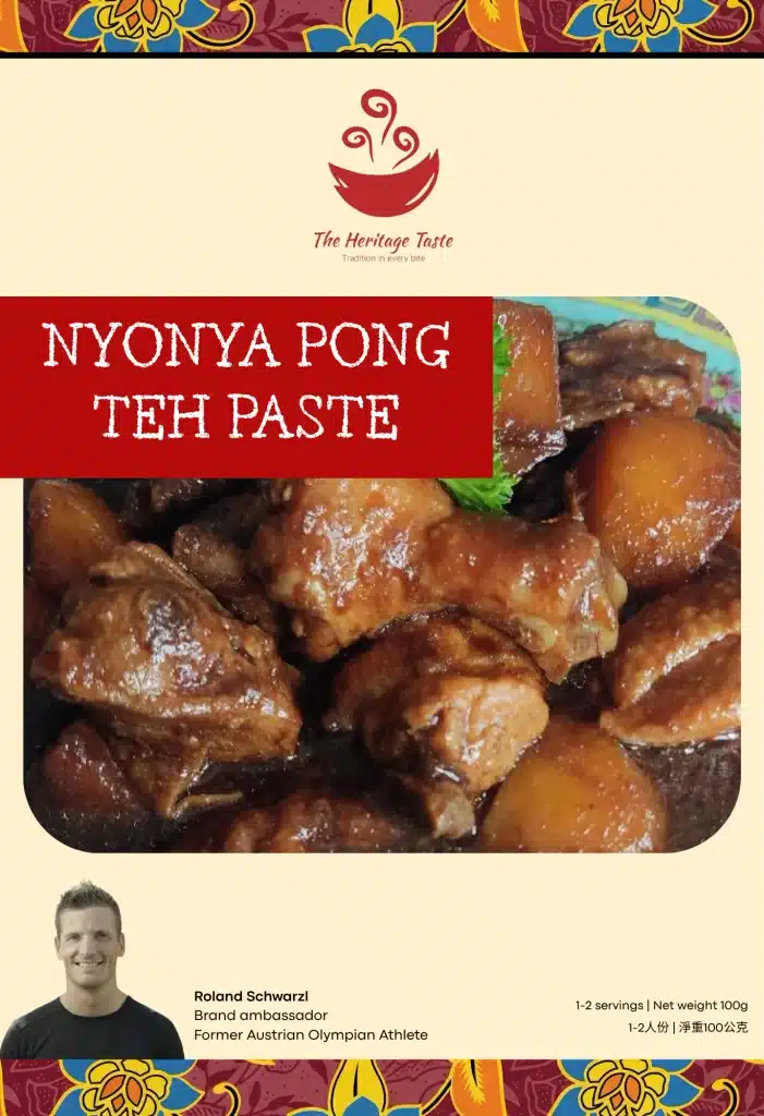
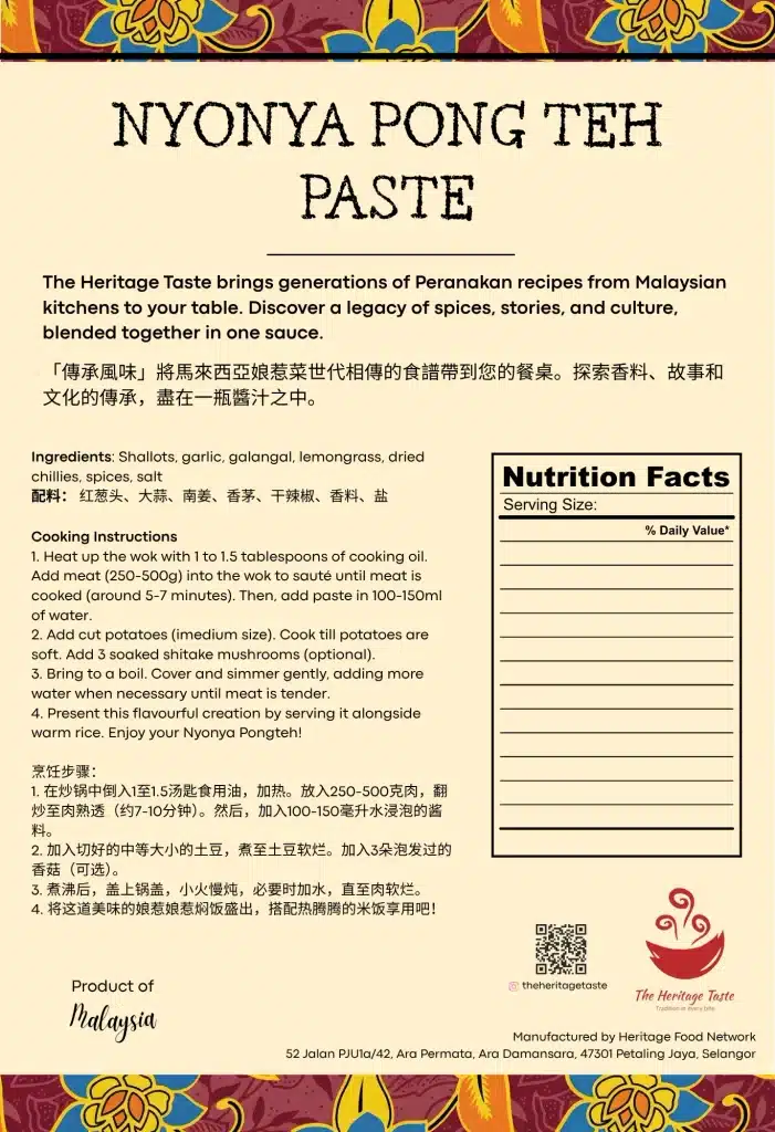
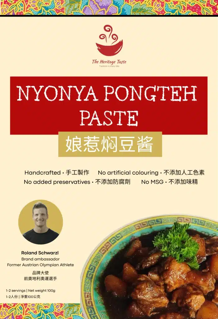
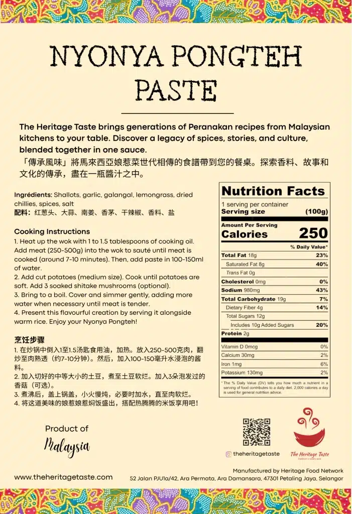
I explored over 20 layout variations! We had an iterative feedback loop with the founder where I presented a few options, gathered feedback and refined the layout. We progressively converged on the final design!
The new packaging
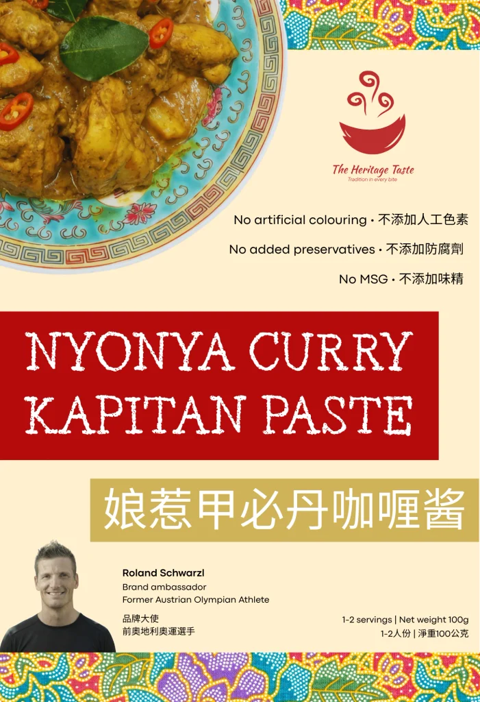
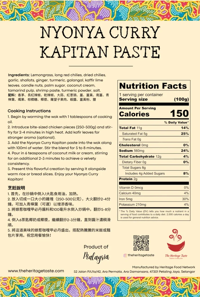
What changed?
- Enhanced visual hierarchy: Replaced the previous ribbon with a bold burgundy banner, significantly improving the readability and impact of the product name on the shelf.
- Seamless bilingual integration: Incorporated Mandarin translations for taglines, ingredients, and instructions, expanding the market reach without cluttering the overall layout.
- Modernized layout: Restructured the nutrition facts panel for better clarity, integrated the brand ambassador, and added a QR code to bridge the physical packaging with the brand’s digital ecosystem.
The printing
Once the final design was approved, I recreated and vectorized all the layouts on Adobe Illustrator, exporting print-ready .ai files directly for the printing company.